
We Redesigned the Good Food Travels Website — Here’s What’s New
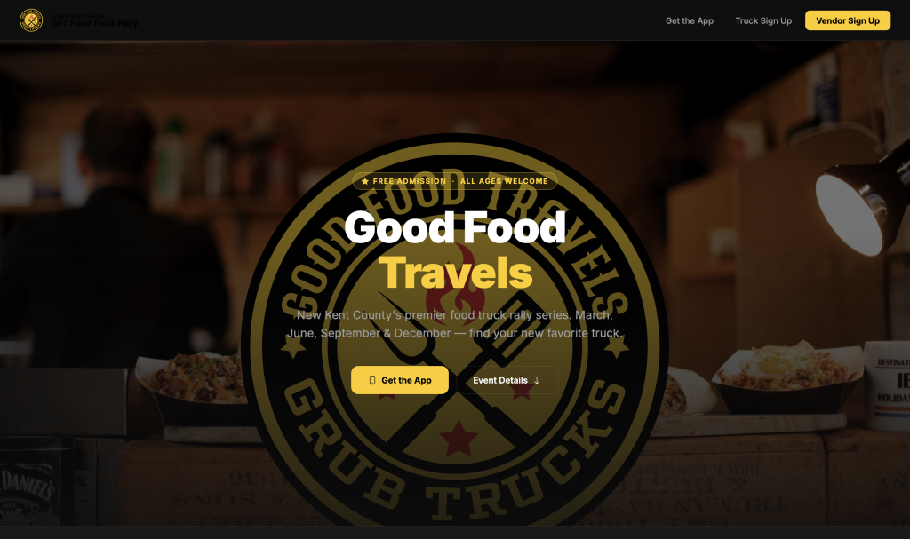
The Good Food Travels Food Truck Rally website has a brand new look, and we couldn’t be more excited to share it with you. We took
everything that was working and rebuilt it from the ground up with a cleaner, faster, and more polished design that better reflects
the energy of the rally itself.
A Dark, High-Tech Look
The biggest change you’ll notice right away is the overall aesthetic. We moved to a deep dark theme — near-black backgrounds layered
with subtle elevated surfaces — that gives the site a bold, modern feel. The brand gold (#FECD06) pops harder than ever against the
dark palette, and it’s used intentionally throughout as a signature accent: in buttons, labels, badges, and the word “Travels” in the
hero title.
A Hero Section That Makes a Statement
The old homepage dropped you straight into a carousel with not much else going on. The redesigned hero is a full-viewport experience
— a dimmed carousel of rally photography sits behind a centered overlay with the event tagline, a “Free Admission · All Ages Welcome”
badge, a bold headline, and two clear calls to action. A soft gradient fades the image into the dark page below for a seamless
transition into the content.
Custom Navigation, Built from Scratch
We replaced the old Bootstrap offcanvas nav with a purpose-built frosted-glass navbar that sticks to the top as you scroll. On
mobile, tapping the hamburger icon opens a full-screen drawer overlay with clean, oversized links — a much smoother experience than
the default Bootstrap slide-in panel.
New Sections That Tell the Story
The redesign introduced several new sections that weren’t on the old site:
– About the Rally — A dedicated intro block that explains what Good Food Travels is all about, sitting on a slightly elevated surface
just below the hero.
– Watch the Rally — An embedded YouTube highlight reel so first-time visitors can see the event in action before they commit to
showing up.
– Event Details — A two-column layout pairing the venue map with a clean event card showing the date, time, address, and a direct
link to get directions.
– Join the Rally — A centered CTA card with sign-up links for food trucks and vendors, topped with a subtle gold gradient line for a
premium feel.
Design That Works on Every Screen
Every section was built with mobile in mind from the start. The event grid collapses from two columns to one on smaller screens,
section padding scales down, the navbar swaps to a hamburger, and all text sizes use clamp() to scale fluidly between screen sizes —
no awkward jumps.
Under the Hood
On the technical side, we dropped the full Bootstrap CSS framework in favor of a custom stylesheet built around CSS design tokens.
All brand colors, surface levels, and border styles are defined as variables at the top of the stylesheet — making future updates a
matter of changing one line rather than hunting through the whole codebase.
—
We’re really proud of how the site came out and hope it gets you just as excited about the next rally as we are.